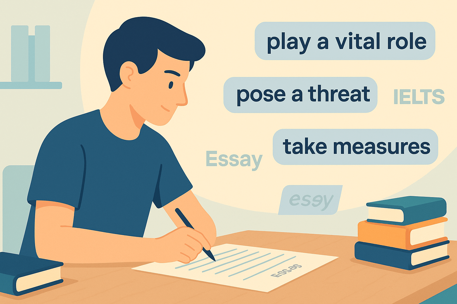

If you’re preparing for IELTS Writing Task 1, you’ve probably seen a question with two different chart types—maybe a bar and line graph, or a pie chart and table—and felt a wave of panic. You’re not alone. Many students struggle with IELTS Mixed Charts vocabulary, often repeating simple words like increase and decrease, and missing the opportunity to score Band 7 or higher.
As a global IELTS teacher, I’ve seen how the right vocabulary can transform a confusing Task 1 into a confident, cohesive answer. In this guide, I’ll teach you:
- What examiners expect in mixed chart responses
- 25+ IELTS Mixed Charts vocabulary words and phrases grouped for trends, comparisons, and proportions
- A real student’s journey from Band 6.0 to 7.5
- Practical tips for writing clear, academic sentences
By the end, you’ll know how to describe mixed charts like a Band 7+ candidate.
Why IELTS Mixed Charts Vocabulary Matters
Mixed charts combine two or more visuals in a single task, often showing related data in different formats—like a bar chart plus a pie chart.
Examiners want to see that you can:
- Identify key features from both visuals
- Make logical comparisons between the datasets
- Use varied, academic vocabulary instead of repeating basic words
- Maintain accuracy and cohesion throughout your 150+ word answer
If your writing says things like “it goes up a lot” or “it is more,” you’ll struggle to get past Band 6. To reach Band 7 or higher, you need precise, formal expressions.
For a complete guide to all IELTS Writing Task 1 vocabulary, explore our IELTS Writing Task 1 Vocabulary Complete Guide.
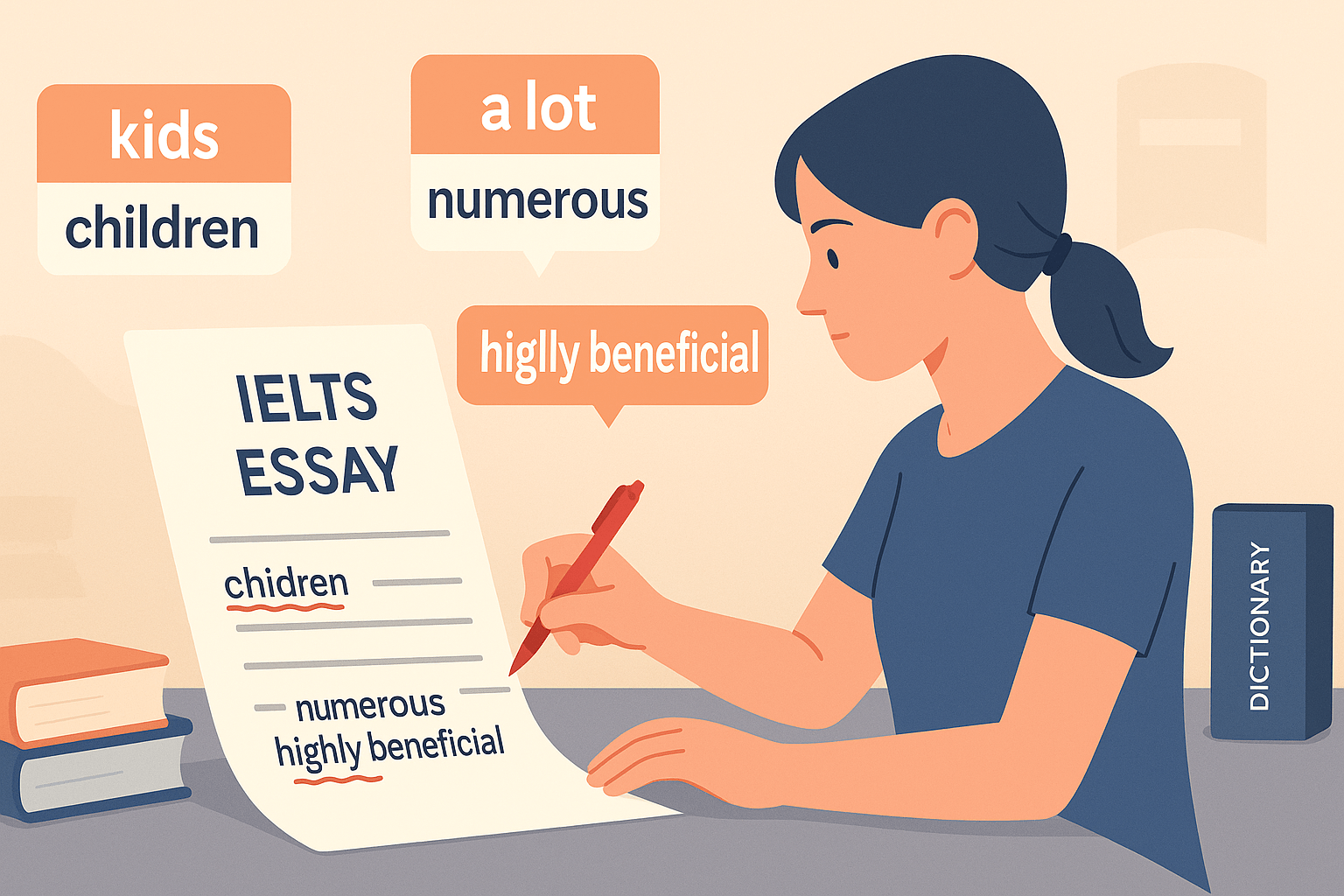
Common Mistakes Students Make
Before learning the right IELTS Mixed Charts vocabulary, let’s quickly address what holds many students back:
- ❌ Describing the charts separately without any comparison
- ❌ Overusing simple words like rise, fall, big, small
- ❌ Ignoring proportions in pie charts or tables
- ❌ Mixing tenses when one chart shows past data and the other is general
The fix? Use targeted, grouped vocabulary to describe trends, comparisons, and proportions accurately.
25+ IELTS Mixed Charts Vocabulary (Grouped)
Here’s my go-to vocabulary set for mixed chart success:
1. Vocabulary for Describing Trends
Perfect for line graphs, bar charts, or any data over time:
Verbs
- increased steadily
- decreased sharply
- fluctuated slightly
- peaked at
- dropped to
- rose gradually
Adverbs + Verbs
- significantly increased
- slightly declined
- rapidly grew
- slowly fell
Example:
“The number of online shoppers rose significantly between 2015 and 2020, while in-store sales fell steadily.”
2. Vocabulary for Making Comparisons
Essential for connecting two chart types in one response:
Linking Words / Phrases
- in contrast
- whereas
- while
- compared to
- similarly
- more/less than
- as opposed to
- followed a similar trend
Example:
“While domestic tourism grew steadily, in contrast, international visits declined by 20%.”
3. Vocabulary for Showing Proportions
Key for pie charts, tables, and combined data sets:
Proportion Phrases
- the majority of
- a small fraction
- one-third of
- almost half
- exactly 25%
- a significant minority
- the same proportion
Example:
“Almost half of the funding came from personal savings, whereas a small fraction relied on government grants.”
Pro Tip: Combine All Three
A Band 7+ answer mixes trend, comparison, and proportion language in both the overview and details.
Student Success Story: From Band 6.0 to 7.5
Meet Aisha, one of my students who struggled with IELTS mixed charts.
Her first attempt:
“The number was high in 2010 and increased a lot in 2020. The pie chart shows different sources like scholarships and money.”
Why it was Band 6.0:
- Vague words: a lot, different sources
- Repetitive sentence structure
- Missing comparison language
After learning targeted vocabulary:
“The number of international students in the UK rose significantly from just over 20,000 in 2010 to nearly 35,000 in 2020. In 2020, almost half of the funding came from personal savings, while a small fraction was provided by government scholarships.”
Result: Aisha’s score jumped to Band 7.5 because she:
- Used trend verbs (rose significantly)
- Applied proportion phrases (almost half, a small fraction)
- Linked both visuals smoothly (while)
Practice Task for You
- Take a mixed chart from Cambridge IELTS 10 or later.
- Write a 150-word response using your current vocabulary.
- Highlight vague words (big, more, a lot).
- Replace them with grouped IELTS Mixed Charts vocabulary from this blog.
- Read it aloud to check clarity and flow.
Final Tips for Mixed Charts Success
- ✅ Describe both charts and make at least 2–3 comparisons
- ✅ Use a mix of trend, comparison, and proportion language
- ✅ Avoid vague words and repetitive sentence structures
- ✅ Check tenses—past for historical data, present for general trends
Explore More Vocabulary Resources
Strengthen your Task 1 skills with these related guides:
- 25 Essential IELTS Line Graph Vocabulary for Band 7+
- 25 Essential IELTS Bar Chart Vocabulary for Band 7+ Writing
- 25 Essential IELTS Pie Chart Vocabulary for Band 7+ Writing
- IELTS Table Vocabulary: 40+ Words to Boost Your Band Score
- 25+ IELTS Map Vocabulary Words to Describe Changes and Locations
- 25+ IELTS Process Diagram Vocabulary Words for Band 7+ Writing
For the complete system, see our IELTS Writing Task 1 Vocabulary Complete Guide.
Official IELTS Resources
Get exam details and free samples from these trusted sources:
- IELTS.org – Official IELTS site
- British Council – Take IELTS
- IDP IELTS