
IELTS Pie Chart vocabulary is essential for Writing Task 1 success. If you’re preparing for the IELTS exam and find pie charts confusing, you’re not alone. Many students struggle with describing proportions, comparisons, and percentages clearly.
The good news? With the right vocabulary, you can turn that struggle into a strength.
In this guide, I’ll share 25+ essential IELTS Pie Chart vocabulary words and phrases that will help you describe data like a Band 7+ candidate. I’ll group words by function, give real-life-style examples, and include tips for using them naturally.
If you want to master all chart types, check out our IELTS Writing Task 1 Vocabulary: The Complete Guide to Graphs, Charts, and Diagrams — it’s our pillar guide that connects all vocabulary resources for Writing Task 1.
Why Vocabulary Matters in IELTS Pie Chart Descriptions
In IELTS Writing Task 1, examiners evaluate you on four criteria:
- Task Achievement
- Coherence and Cohesion
- Lexical Resource (vocabulary)
- Grammatical Range and Accuracy
Lexical Resource specifically checks if you:
- ✅ Use precise and varied vocabulary
- ✅ Avoid informal or repetitive words
- ✅ Maintain an academic tone
If you rely on words like “shows,” “goes up,” or “big amount”, your score may plateau around Band 6.
To reach Band 7 or higher, your writing must:
- Show a wide range of vocabulary
- Demonstrate precision and academic style
- Vary expressions to avoid repetition
IELTS Pie Chart Vocabulary: Grouped by Function
To make learning easier, I’ve organized vocabulary by usage. Use this as a quick-reference bank whenever you practice Task 1.
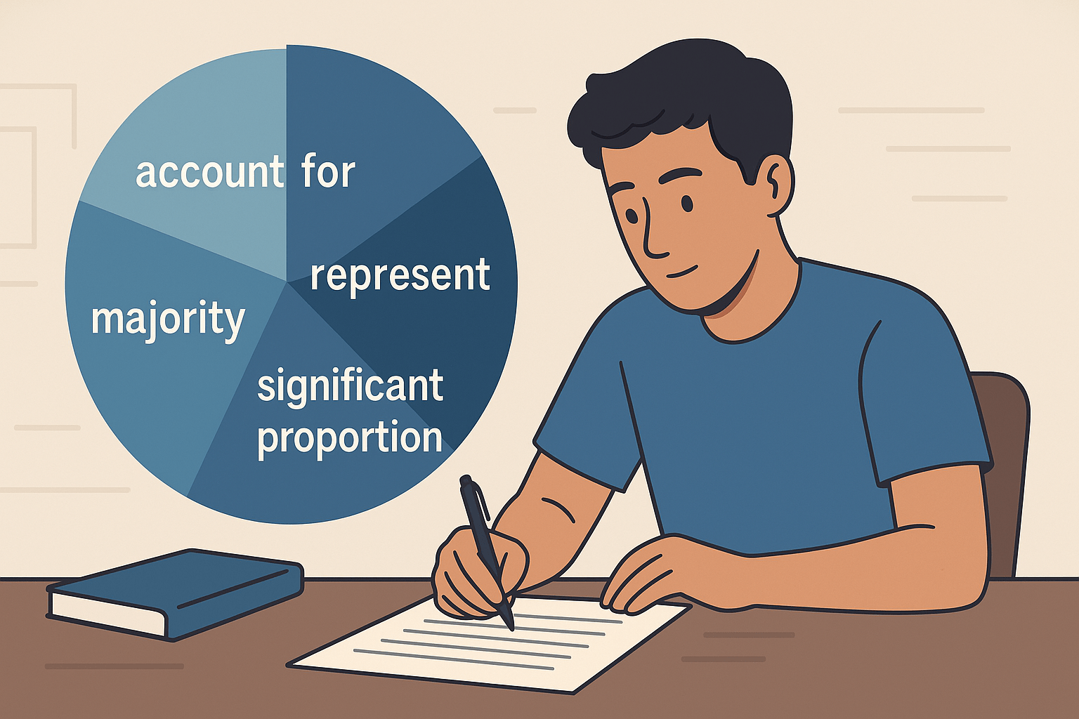
1. Verbs for Describing Proportions
These verbs describe what each slice of the pie represents:
- account for
- represent
- comprise
- make up
- constitute
- illustrate (for what the chart shows overall)
- indicate
- depict
Examples:
- Females accounted for 45% of total enrollment.
- Food expenses represented the highest proportion of spending.
- Renewable energy sources made up just 15% of total usage.
Teacher Tip:
Instead of repeating “shows,” try using illustrates or depicts for variety.
2. Nouns and Phrases for Percentages
These phrases help you express fractions and proportions accurately:
- a small proportion / a significant percentage
- a minority / a majority
- an equal share / a tiny fraction
- just under / just over
- one-third / two-thirds / a quarter
Examples:
- A minority of the budget was spent on leisure activities.
- Healthcare and housing had equal shares, each at 20%.
- Just over a third of the population preferred online shopping.
3. Comparison Phrases
Pie charts often require comparing slices to show dominance or difference:
- higher / lower than
- more / less than
- twice as much as / three times more than
- the largest / smallest portion
- similar to
- compared to / in comparison with
- significantly more / marginally less
Examples:
- The proportion of spending on food was twice as high as on clothing.
- Education and transport had similar shares, at 15% and 14% respectively.
- Compared to 2010, the budget for health increased significantly in 2020.
4. Adjectives and Adverbs for Degree
These words add nuance and academic tone to your sentences:
Adjectives: dominant, minimal, equal, noticeable, substantial
Adverbs: significantly, slightly, marginally, considerably, dramatically, predominantly
Examples:
- Housing was the dominant expense category.
- Transport spending was marginally lower than utilities.
- The pie chart is predominantly divided among four key sectors.
5. Time Connectors and Sentence Starters
If your Task 1 has two pie charts or shows change over time, these connectors help structure your answer:
- in 2010 / by 2020 / during the decade
- over the period / throughout the timeframe
- between the two years
- remained stable
- saw an increase / decrease
Examples:
- Between 2000 and 2010, spending on education increased noticeably.
- Over the decade, transport became a more dominant expense.
- Healthcare remained stable at around 15%.
Sample Band 7+ Sentence Using Pie Chart Vocabulary
Task:
The pie charts show the percentage of different types of energy production in a European country in 1990 and 2010.
Sample Sentence:
In 1990, fossil fuels accounted for nearly two-thirds of energy production, while renewables made up a minority share of just 12%. By 2010, however, renewable sources constituted a significant portion, increasing dramatically to 32%.
Breakdown:
- accounted for / made up / constituted = precise academic verbs
- two-thirds / minority share / significant portion = formal fraction and proportion expressions
- dramatically = high-level adverb for emphasis
Common Mistakes to Avoid
- Repeating “show/shows”
- ❌ The chart shows X. The chart shows Y.
- ✅ Use illustrate, depict, present.
- Mixing up percentages and fractions
- Keep consistent formatting: write “35%” or “roughly a third,” but not both for the same data.
- Being vague
- ❌ A lot of the budget went to rent.
- ✅ A significant proportion of the budget was allocated to rent.
- Overusing one comparison phrase
- Mix more than, twice as much as, and marginally higher than.
- Casual tone
- Avoid words like a bunch, loads, or stuff. Use formal vocabulary.
Practice Activity
Prompt:
The pie charts show the proportion of different types of transportation used by people in one city in 2000 and 2020.
Task:
Write 3 sentences using at least five of the vocabulary items from this blog. Include:
- One verb
- One adverb
- One comparison phrase
- One percentage phrase
Example Answer:
In 2000, cars accounted for the largest portion of transport use, at just over half. By 2020, public transport usage increased significantly, while bicycle use remained marginally lower than walking.
Tips to Learn and Remember Pie Chart Vocabulary
- Group similar words in a notebook or digital sheet
- Practice with flashcards using apps like Anki
- Write one sentence daily using 2–3 new words
- Analyze real IELTS pie charts from Cambridge books or IDP samples
- Avoid repetition — mix “account for,” “comprise,” and “represent”
Final Thoughts
Mastering IELTS Pie Chart vocabulary will help you:
- ✅ Describe data precisely
- ✅ Compare categories naturally
- ✅ Write in a formal, academic style
Combine this vocabulary with strong grammar and clear structure, and you’ll be on your way to Band 7+ in Writing Task 1.
🔗 Next step: Strengthen your overall Task 1 vocabulary with our IELTS Writing Task 1 Vocabulary: The Complete Guide to Graphs, Charts, and Diagrams to cover line graphs, bar charts, maps, and processes too.


7 Responses
Howdy! I simply would like to give you a huge thumbs up for your great info you’ve got here on this post.
I’ll be returning to your site for more soon.
Howdy! 😊 Thanks a ton for the thumbs up — I’m really glad you found the info helpful. Can’t wait to have you back on the site soon for more! 🙌
Hello i am kavin, its my first occasion to commenting anyplace, when i read this post i thought i could also make comment due to this
brilliant paragraph.
Hi Kavin,
Thanks for your kind words and for taking the time to leave your very first comment — that means a lot! I’m glad the paragraph inspired you. You’re always welcome to share your thoughts here. Looking forward to hearing more from you!